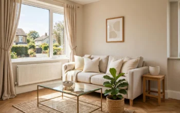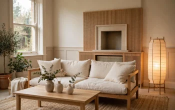
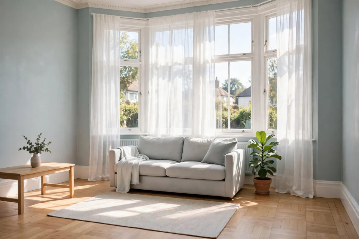
A south-facing room is the opposite problem to a cold, north-facing room. It does not need warming up. It needs calming down. In summer the sun can pour in from late morning until evening, colours look stronger than they did on the sample card, whites can glare, and a warm cream that looked soft in the shop can turn yellow by mid-afternoon. In winter the same room can still feel bright at midday and flat and cool in the evening, once the sun has gone.
The job of a south-facing palette is therefore different. It is not to add warmth. It is to hold its colour in strong light, to stay comfortable to sit in when the sun is at its highest, and to still look right in the evening under lamps. This guide explains how to do that: how to confirm a room really faces south, the cooling rule that decides most choices, the whites that stay white, the palettes that work, how to protect fabrics and flooring from fading, and ready-made palettes by room use and time of day.
It is the sibling to our guide to north-facing living room colours. The two rooms need opposite handling, and using the same palette in both is the most common reason a colour scheme looks right in one room and wrong in the next.
The Strong-Light Problem
In the UK, a south-facing window receives direct sun for the longest part of the day. That matters for colour in three ways.
First, strong light raises the apparent strength of a colour. A mid-tone paint that looked balanced in the shop can look a shade or two stronger on a south-facing wall at 2pm. Pale colours can look washed out in the brightest patch and correct in the shaded corner of the same room, so the room can look uneven even when the paint is even.
Second, strong light warms colour. Sunlight in the afternoon has a golden cast, and it pushes warm undertones forward. A yellow-based cream, a warm beige or a peachy pink will all look warmer, and sometimes yellower, in a south-facing room than they did anywhere else. That is why rooms painted to feel warm and cosy in a north-facing house can feel hot and restless when the same colours are used facing south.
Third, strong light is not constant. A south-facing living room at noon in June, the same room at 6pm in June, and the same room at 4pm in January are three different rooms. A palette has to survive all three, not just the brightest moment. Test swatches at midday and in the evening, with the lamps on, before you commit. A colour that only works at noon will disappoint for most of the hours you actually use the room.
How to Check Which Way Your Room Faces
Before you buy paint, confirm the aspect. Guessing wrong leads to the wrong palette, especially in through-lounges and in flats where the front and back rooms face different ways.
Use the compass on your phone and stand at the main window, facing out. Note the direction the window faces, not the direction you walk in from. Watch the light through the day. A south-facing room gets sun for most of the day, with the strongest light around midday and in the early afternoon, and a clear patch of sun that moves across the floor. A room that gets a clear burst of morning sun and then goes flat faces east. A room that warms up late in the afternoon faces west.
Check a map if the compass reading is unclear. Find your street, work out which side of the house the room sits on, and read the direction from there. In a through-lounge, test each end separately. The front bay and the rear extension can need slightly different handling, even when they share one paint colour, because one end may catch the sun earlier or later than the other.
If the room faces south-east or south-west rather than due south, the same cooling palette still applies, with a little more flexibility. South-east rooms get their strongest light in the morning and are easier in the afternoon. South-west rooms stay bright later and can feel hottest in the late afternoon and early evening. The closer the room is to due south, the more strictly you should follow the cooling rule below.
The Cooling Rule
Every paint colour has an undertone, the hint of another colour sitting underneath the main colour. A white can lean yellow, pink, grey or blue. A grey can lean warm towards beige or cool towards blue. In a south-facing room, the undertone decides how the colour actually looks on the wall, because the strong, warm sunlight pulls warm undertones forward.
The rule is simple: choose cool or neutral undertones, and be careful with warm ones. Look for whites and neutrals described as cool, clean, grey-based or with a blue or green base, and be cautious with those described as creamy, buttery, golden or honeyed. For greys, choose a cool grey or a blue-grey rather than a greige, which is a grey mixed with beige and will warm up considerably in south light. For greens, choose a cool sage or a muted green with a blue base rather than a yellow-green. For blues, choose a muted, dusty blue rather than a bright or icy blue, which can glare in the strongest light.
Test the rule before you commit. Paint a large swatch on the wall, at least the size of a sheet of paper, and look at it in the morning, at midday in full sun, and in the evening with the lamps on. Small sample cards lie in south-facing light just as they do in north-facing light, but in the opposite direction: they hide how strong and how warm a colour will become. A large swatch on the actual wall, next to your sofa and flooring, tells the truth. If the swatch turns yellow or looks much stronger by mid-afternoon, the undertone is too warm for the room, however calm it looked in the shop.
The cooling rule does not mean the room has to feel cold. It means the walls should not add heat that the sun is already adding. Warmth in a south-facing room should come from wood, textiles and lamps in the evening, where you can control it, not from wall paint that is warm all day whether you want it or not.
Whites That Stay White
White is the most common choice for a south-facing room, and the most likely to disappoint. The wrong white glares in full sun, turns yellow by afternoon, or looks grey in the evening. The right one stays calm through the day.
Look for a cool or neutral white with a soft grey or blue undertone, not a strong cream. On the wall it should read as white in daylight, without a yellow cast in the afternoon sun. Avoid brilliant white and pure white in a very bright room if glare is a problem. They have no undertone to soften the light, so in full sun they can look stark and hard on the eyes, and they show every mark and shadow.
Pair the wall white with a slightly different white for woodwork, so doors and skirting do not disappear into the walls. A woodwork white one step cleaner or one step cooler than the wall colour gives a quiet contrast that reads as intentional. Keep the ceiling in a plain white rather than the wall colour, unless the ceiling is low and you want the room to feel calmer and more enclosed, in which case carrying a pale wall colour up can soften the junction between wall and ceiling.
Sheen matters in a south-facing room more than in a dimmer room. A matt or flat matt emulsion softens strong light and hides small wall imperfections. A silk or high-sheen finish reflects the sun and can glare, especially on a wall opposite a large window. Use matt on the main walls, and save a slightly more washable finish for woodwork and for walls that need regular cleaning, such as a kitchen-diner.
If you repaint, the method matters as much as the colour. A careful, even finish stops the light catching roller marks and patches, which show up far more clearly in strong sunlight than in soft light.
Cooling Palettes That Work
Once the white base is settled, these colour families work reliably in south-facing rooms in UK homes:
Cool pale grey. A light cool grey is the workhorse of the south-facing palette. It is deep enough to give the walls presence, cool enough not to turn yellow, and neutral enough to sit with most sofas and wooden floors. Use it on all four walls in a larger room, or on one or two walls with a cool white elsewhere in a smaller room. Avoid a grey that leans beige on the card. In south light that beige will come forward, and the room will warm up in exactly the way you were trying to avoid.
Dusty blue. A muted, dusty blue adds calm without shouting, and it suits bedrooms and living rooms particularly well. It reads as cool in strong light without looking icy, provided you keep it muted rather than bright. Pair it with cool white woodwork and pale wood so it reads as restful rather than cold. In a room used mainly in the evening, add warm lamps and warm wood to balance it after sunset.
Cool sage green. A sage with a blue or grey base brings a calm, natural feel and works well with wooden floors, plants and linen fabrics. Choose a sage that leans cool or neutral. A sage that leans yellow will warm up in the afternoon sun and can look more like a yellow-green than the calm green you chose. Cool sage is a good bridge between a pale scheme and a deeper feature colour, because it holds its character in both bright and lamplight.
Pale stone and soft putty with a grey base. A pale stone colour with a grey rather than a yellow base gives warmth of tone without warmth of undertone. It suits period homes and rooms with warm wooden floors, because it does not fight the wood, but it does not add extra heat either. Test it carefully at midday. If it turns creamy in full sun, it is too warm for a south-facing wall, however good it looked on the card.
Muted terracotta and clay as accents only. Warm accent colours still have a place in a south-facing room, but as textiles and objects, not as wall colour across all four walls. Cushions, a throw, a rug pattern, artwork or one armchair in a muted terracotta or warm clay gives the room life and contrast against cool walls, and you can remove or change those pieces in summer if the room feels too warm. Used this way, warm accents do not overheat the room, because they cover a small area and you control them.
The thread through all of these is coolness in the undertone, not coldness in the colour. A muted cool colour will look calmer and more expensive in south light than a bright warm colour, which will look louder and hotter than intended.
Colours to Avoid and Why
Some colours that look excellent in a shop or in a north-facing room fail in a south-facing room:
- Warm creams and buttery yellows. They match the warm afternoon sun instead of balancing it, so the room feels hotter and the walls can look yellow by mid-afternoon.
- Bright whites with no undertone. With nothing to soften the light, they glare in full sun and make the room feel stark rather than bright.
- Strong, saturated colours across all four walls. A deep red, a bright orange or a strong yellow that looked exciting on a small card can dominate a south-facing room in full sun and make it hard to relax in.
- Warm beige and greige as a whole-room colour. Their beige base is pulled forward by the sun, so they read as warmer and yellower than expected, especially in the afternoon.
- Very pale warm neutrals. A pale colour with a warm undertone can look washed out in the brightest patch and yellow in the shaded corner of the same room, leaving the walls looking uneven.
This does not mean you can never use warm colour in a south-facing room. A deep, warm colour on one wall, or warm colour in furniture and textiles, can work as a deliberate contrast. The risk is with warm, pale or mid-tone colours spread across all four walls, where there is nothing cool to balance the sun.
Fabric Fading, Flooring and Sun Damage
Strong sunlight does more than change how a colour looks. Over time it changes the colour itself. This is the practical side of a south-facing palette that paint choice alone cannot solve.
Fabrics fade first. Cushions, curtains, rugs and sofa fabric in direct sun will fade unevenly, with the sunniest side fading fastest. The risk is highest for strong, saturated colours and for natural dyes, and lowest for pale, solution-dyed or fade-resistant fabrics. If a sofa or a rug will sit in direct sun for several hours a day, choose a paler or more muted colour for that piece, or accept that it will soften over time and plan for it. Rotate cushions and throws regularly so fading is even rather than patchy, and move a favourite cushion out of the direct sun patch in summer if you want to keep its colour.
Curtains and blinds are your main defence, and they need to be planned as part of the palette, not added afterwards. Sheer white curtains filter strong light, cut glare and protect fabrics behind them, while still letting daylight in. They are the simplest fix for a south-facing living room, and they suit the cooling palette because they soften the light without adding colour. For bedrooms, a sheer layer plus a blackout blind or lined curtain gives you both daytime filtering and darkness for sleep. For a home office, a blind that cuts glare on a screen matters more than a curtain that only looks good. Avoid very dark curtains in a south-facing room unless they are lined and kept out of direct sun when drawn back, because dark fabric absorbs heat and can fade fastest of all.
Flooring fades and warms too. Wooden floors in strong sun can change tone over time, and rugs can leave a lighter patch on the floor or on a carpet underneath where they have protected it from the sun. A pale rug over a wooden floor, as in our featured image, protects the floor in the sunniest patch and is easier to replace than the floor itself. If you have a rug in a south-facing room, lift it occasionally and check the floor underneath, and rotate the rug if one end sits in sun and the other does not.
Artwork, photographs and books also fade in direct sun. Keep valuable prints and photographs out of the direct sun patch, or hang them on a wall that does not face the window. This is a small point, but it is the one south-facing homeowners notice years later, when a framed print has faded on one side and the paint behind it has not.
Flooring, Furniture and Textile Colours
Wall colour alone cannot calm a south-facing room. The floor, the sofa and the textiles do at least as much work, because they sit at eye level and catch the sun directly.
Flooring. Pale wooden floors, light oak or a pale rug over a darker floor, help more than dark, warm-toned flooring, which absorbs heat and can make the room feel hotter underfoot in summer. A pale rug over a wooden floor also works, and it is the cheaper fix if replacing the floor is not planned. Choose a rug large enough that the front feet of the sofa sit on it, so the seating area reads as one cool zone rather than separate pieces on a bright floor.
Sofa and furniture. A sofa in a cool neutral, a pale grey, a muted blue or a cool sage will anchor the room. A sofa in a warm cream or a strong warm colour will repeat the problem of the walls and can look yellower in afternoon sun than it did in the shop. Wooden furniture in a light or medium tone suits the palette better than very dark, glossy finishes, which can glare in strong light and show dust and marks more clearly.
Fabrics and curtains. Curtains in a sheer white, a pale linen or a cool, muted pattern add texture without adding heat, and texture reads as calm in a room with very strong light. Keep curtains light enough to filter rather than block daylight during the day, and draw a heavier layer in the evening so the room feels enclosed rather than exposed. Cushions and throws are the easiest way to test a colour: try dusty blue, cool sage or muted clay against your walls before committing to paint, and check them at midday as well as in the evening.
If the room is also small, the layout matters as much as the colour. Our guide to small living room layout ideas for UK terraced houses covers the measured layouts that work alongside a cooling palette, including walkway clearances and sofa positions that keep a bright room feeling ordered rather than crowded.
Lighting for a Room That Is Already Bright
A south-facing room needs less artificial light in the day, and different light in the evening. Getting this wrong makes the room feel harsh at noon and flat at night.
In the day, use the sun as the main light and control it, rather than adding to it. Sheer curtains, a blind angled to cut glare, and furniture placed so you are not sitting facing directly into the sun all matter more than extra lamps. If you work from home in a south-facing room, place the desk so the screen does not face the window, and use a blind to cut glare rather than turning up the screen brightness.
In the evening, the room changes completely. The sun is gone, and a cool palette that looked calm at noon can look cold under the wrong lamps. This is where warm light earns its place. Use warm white bulbs in the evening, and keep the bulb colour consistent from lamp to lamp. Mixed bulb colours, one yellow and one blue-white, make the wall colour look inconsistent from one side of the room to the other.
Use layers rather than one bright ceiling light. Ambient light from the ceiling, task light from a floor lamp beside an armchair or a table lamp beside the sofa, and accent light in a dark corner or alcove all help the room move gradually from daylight to lamplight. Switch lamps on before it gets fully dark, so the room does not suddenly feel gloomy when the sun drops. If you like a calm, natural palette in the evening as well as the day, our guide to Japandi living room ideas for UK homes shows how warm wood, linen and low lamps balance a pale scheme after sunset, without repainting the walls warm.
Palettes by Room Use and Time of Day
A south-facing room is not one problem. A living room used in the afternoon, a bedroom used in the morning and at night, and a kitchen-diner used all day need different handling, even when they face the same way.
South-facing living room, used mainly in the afternoon and evening. This is the hardest case, because the room is at its brightest when you want to relax in it. Walls in cool pale grey or dusty blue, woodwork in cool white, sofa in pale grey or muted blue, pale rug, sheer white curtains, and warm lamps for the evening. Warm accents in cushions and artwork only, so the room can be cooled in summer by removing a throw and warmed in winter by adding one. Test the wall colour at 2pm and at 7pm, not just at noon.
South-facing bedroom, used in the morning and at night. A bedroom needs to be calm in bright morning light and dark enough for sleep. Walls in cool sage or dusty blue, bedding in cool white or pale grey, and a sheer layer plus a blackout blind or lined curtain. Avoid warm cream bedding in a south-facing bedroom, because it will look yellow in morning sun. Keep the palette cooler than the living room, because a bedroom that feels hot in the morning is harder to sleep in at night, especially in summer.
South-facing kitchen-diner, used all day. A kitchen-diner gets sun through meals, work and evening use, so the palette has to work in all three. Walls in cool white or pale cool grey, cabinets in a cool neutral rather than a warm cream, and a washable matt finish that does not glare. Use a blind rather than a heavy curtain, so glare can be cut at midday without darkening the room. Warmth in a kitchen-diner should come from wood, plants and tableware, which can be changed easily, not from wall paint that is warm all day.
South-facing home office, used in working hours. Glare is the main problem here, not colour alone. Walls in a pale cool neutral that does not reflect strongly, a blind that cuts direct sun on the screen, and a desk placed at right angles to the window rather than facing it or with your back to it. A cool palette helps concentration in a bright room, but a completely white, glossy office will glare. Matt finishes and a muted accent wall behind the desk, out of the direct sun patch, work better than a bright white box.
South-facing rooms in flats and new-builds. New-build flats often have large south-facing windows and less wall to absorb light, so the room can feel brighter and hotter than a period house with smaller windows. The same cooling rule applies, but window treatment matters even more. A sheer layer is almost essential, and a pale rug and pale sofa matter more than in a larger room, because there is less furniture and flooring to break up the light.
Mistakes That Undo a South-Facing Palette
A few common mistakes undo an otherwise good south-facing scheme. Choosing the wall colour from a small card in a shop, without a large swatch in the room at midday, is the first. The second is using the north-facing palette in a south-facing room, because a friend recommended it or because it worked in another house. Warm greige, warm cream and ochre walls that warm a cold room will overheat a sunny one.
The third is forgetting the evening. A palette chosen only for noon will look cold at night, and a room that is only comfortable for three hours a day is not a success. Always check the colour with lamps on, and plan warm evening lighting from the start.
The fourth is ignoring fading. Buying a strong-coloured sofa or rug for the sunniest patch, with no sheer curtain and no rotation plan, guarantees uneven fading within a year or two. Plan the window treatment and the fabric choice together, not separately.
The fifth is over-cooling the room. A south-facing room painted in icy blue, with glossy white floors, chrome furniture and no wood or textile warmth, can feel clinical in winter and in the evening, when the sun is gone. Cooling the undertone is not the same as removing all warmth. Keep wood, linen, plants and warm lamps in the room, so it feels calm in sun and comfortable after sunset.
Frequently Asked Questions
What is the best colour for a south-facing living room?
A cool or neutral palette works best: cool pale grey, dusty blue, cool sage or a pale stone with a grey base, with cool white woodwork. Avoid warm creams and greige as a whole-room colour, because the afternoon sun will push their warm undertones forward and make the room look yellow and hot.
Should I use warm or cool white in a south-facing room?
Cool or neutral white. A warm white that looks soft in a shop can turn yellow in south-facing afternoon sun. Choose a white with a soft grey or blue undertone, test a large swatch at midday and in the evening, and use a matt finish to avoid glare.
Do south-facing rooms need darker colours?
Not necessarily darker, but cooler. A pale cool colour often works better than a dark colour, because dark colours absorb heat and can make a sunny room feel hotter. If you want depth, use a muted mid-tone on one wall, such as dusty blue or cool sage, and keep the other walls pale and cool.
How do I stop furniture and curtains fading in a south-facing room?
Use sheer white curtains to filter direct sun, choose paler or fade-resistant fabrics for pieces that sit in the sun patch, rotate cushions and rugs regularly, and keep valuable artwork out of direct sun. A pale rug over a wooden floor also protects the floor in the sunniest area.
Is a south-facing bedroom too hot in summer?
It can feel hot if the palette and window treatment add heat. A cool palette, a sheer layer plus a blackout blind, pale bedding, and ventilation in the evening help. Avoid warm cream walls and bedding, which will look and feel warmer in morning sun.
Can I use the same colours in a south-facing and a north-facing room?
It is not recommended. North-facing rooms need warm undertones to balance cool, indirect light, while south-facing rooms need cool or neutral undertones to balance strong, warm sunlight. Using one palette in both usually means one room looks right and the other looks wrong. Treat each aspect separately, even in the same house.