Paint Colours That Make a Small Room Look Bigger: A UK Guide to Light, LRV and Finish
Paint will not make a small room physically bigger. No colour can move a wall, raise a ceiling or add a window. What paint can do is change how the room feels when you walk into it, and in a small room that feeling is often the whole problem. A colour that reflects light well, sits calmly with the furniture and does not chop the room into competing blocks will make the space feel open and easy to live in. A colour that fights the light, clashes with the sofa or stops the eye at every corner will make the same room feel cramped, even if the measurements have not changed.
This guide is about paint colour only. It does not repeat the layout, mirror and furniture advice in our guide to making a small living room look bigger, although colour works best alongside those changes. Here the focus is on the decisions paint forces you to make: how light a colour needs to be, whether it should be warm or cool, what to do with the ceiling and woodwork, whether to paint one wall or all four, which finish to choose, and how to test a colour in your own room before you commit to it.
Start With How Paint Behaves in Light, Not With a Shade Card
A paint colour is not a fixed thing. It is a surface that reflects the light falling on it, and that light changes through the day, through the seasons and from one side of a house to the other. A pale colour in a bright south-facing room can look washed out by midday. The same colour in a north-facing room can look grey by morning. A colour that looks fresh in a shop, under bright retail lighting, can look yellow under warm lamps at home.
Two ideas explain most of what goes wrong. The first is undertone, the hint of another colour sitting underneath the main colour. A white can lean yellow, pink, grey or blue. A grey can lean warm towards beige or cool towards blue. A green can lean warm and earthy or cool and minty. In a small room, the undertone matters more than the colour name, because there is less wall to absorb a mistake and the colour is in your eye line from every seat.
The second idea is light reflectance value, usually shortened to LRV. Paint brands print an LRV number for many colours, and it is worth understanding in plain terms. LRV runs roughly from 0 to 100. A colour close to 0 absorbs almost all light and looks near black. A colour close to 100 reflects almost all light and looks near white. Most useful small-room wall colours sit in the upper part of that range, roughly from the mid 70s upwards for a pale main colour, with mid-tones for a feature wall sitting lower. You do not need to memorise numbers. The practical point is simple: a higher LRV reflects more light back into the room, so the walls recede and the room feels brighter. A lower LRV absorbs more light, so the walls advance and the room feels more enclosed, which can be cosy in a large room but closing in a small one.
LRV alone does not decide a colour. Two colours can share a similar LRV and look completely different, because one is warm and one is cool, or one is saturated and one is muted. Use LRV as a first filter, to keep the main colour light enough, then judge undertone and saturation by testing swatches in the room itself. A colour with a high LRV but a cold undertone in a north-facing room will still feel cold. A warm colour with a slightly lower LRV will often feel more welcoming, because it works with the light rather than against it.
Match the Colour to the Direction the Room Faces
Light direction is the quickest way to narrow a shortlist, and it is why a colour that works in one small room can fail in the next room in the same house.
In a north-facing room, the light is indirect for most of the day, with a cool, blue-grey cast. Colours shift cooler in that light, so the job is to add warmth back. Choose warm whites, warm greige, warm sage, dusky pink or warm taupe, and avoid brilliant white, icy blue-grey and cool mint on large areas, because they will match the cool light instead of balancing it. Our guide to north-facing living room colours explains the warm undertone rule in full, and the same rule applies to any small north-facing room, not just a living room.
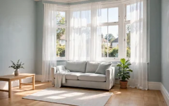
In a south-facing room, the light is strong for much of the day and can push warm colours towards yellow. Here the job is to keep the room calm without making it cold in winter. Pale blue-grey, soft green-grey and cool whites work well, paired with white or very pale furnishings and curtains that filter rather than block the sun. Avoid strong warm creams and saturated warm yellows on all four walls, because strong sun will exaggerate their warmth.
In an east-facing room, morning light is clear and the afternoon is softer. Pale warm neutrals suit this pattern well, because they look fresh in the morning and stay calm in the evening. In a west-facing room, the warmest light arrives late in the day, which is often when the room is used most. A pale cool neutral can balance that evening warmth, or a pale warm neutral can let the evening light do the warming, provided the walls stay pale and the colour is tested late in the afternoon, not just in the morning.
In a room with a small window, a window facing a neighbouring wall or a lightwell, treat the light as north-facing even if the compass says otherwise. The light that actually arrives is indirect and weak, and the palette should be pale and warm, with a white ceiling and mirrors to bounce what light there is.
The Colours That Reliably Make a Small Room Feel Larger
With light direction settled, these colour families are the reliable starting points for a small room. They are not a ranking, because the right choice depends on light, furniture and the rest of the house. They are the families that most often succeed.
Warm white is the safest main colour for most small UK rooms. It reflects a great deal of light, sits calmly with wood, linen and most sofa colours, and does not impose a strong character on the room. The caution is in the undertone. Brilliant white can look stark and slightly blue in cool light, and a very creamy white can turn yellow under warm lamps. Look for a warm white described as soft, with a gentle yellow, pink or beige base, and test it on the wall, not just on the card.
Pale greige, a grey mixed with beige, is the workhorse neutral when plain white feels too plain. It is warm enough to avoid the coldness of a blue-grey, deep enough to give the walls presence, and neutral enough to sit with light wood, pale sofas and natural textiles. In a small room, keep greige pale on most walls and use a slightly deeper greige only as an accent, on one wall or in soft furnishings.
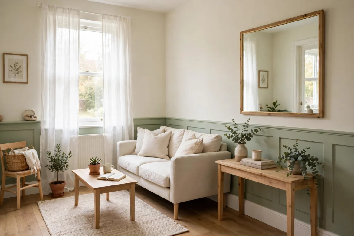
Pale sage green brings a calm, natural feel and works well with wooden floors, plants and linen. Choose a sage with a warm, earthy base in a north-facing room, and a softer green-grey sage in a south-facing room. Avoid mint greens, which are cooler and brighter and can look thin on a large wall area.
Pale blue-grey and dusty blue suit rooms with good light, especially south-facing and west-facing rooms. Cool colours can make walls feel as if they recede slightly, which is why pale blues often work in small rooms. Keep the blue pale and muted, not saturated, and pair it with white woodwork and pale furnishings so the room stays bright rather than cold.
Dusky pink, a muted, earthy pink rather than a bright pink, adds warmth without heaviness and suits period homes particularly well, because it sits comfortably with warm wood and traditional features. In a small room it works best as a feature wall colour or in textiles, with pale warm white on the other walls, rather than on all four walls.
Pale warm neutrals such as pale taupe, pale beige and soft cream sit between white and greige. They are useful when a room needs warmth but white feels too clinical. Keep them pale, keep the undertone consistent across walls, bedding or sofa and rug, and avoid mixing a warm wall with cool grey furniture, because mismatched undertones are a common reason a small room feels unsettled without an obvious cause.
One Colour, One Feature Wall, or Colour Drenching?
Once a colour family is chosen, the next decision is how much of it to use, and this decision changes the sense of size as much as the colour itself.
Painting all four walls in one pale colour is the simplest way to make a small room feel larger. With no sharp changes of colour, the eye travels around the room without stopping, and the room reads as one continuous space. This works best when the colour is genuinely pale, the ceiling is white or very pale, and the furniture and textiles stay in the same light family. A pale colour on all four walls with dark, heavy furniture will still feel crowded, because the furniture, not the paint, is doing the chopping.
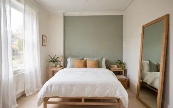
A single feature wall can work, provided the feature colour is muted rather than dark and the other walls stay pale. In a living room, the wall behind the sofa or fireplace is the usual choice. In a bedroom, the wall behind the bed is the usual choice, as explained in our guide to bedroom colour schemes for small bedrooms. A muted mid-tone, such as warm greige, muted sage, dusty blue or dusky pink, gives the room a focal point without closing in the other walls. Repeat the feature colour in cushions, a throw or artwork, so the wall looks connected to the rest of the room rather than pasted on.
Colour drenching, painting walls, ceiling, woodwork and sometimes radiators in one continuous colour, removes visual breaks altogether and can make a small room feel larger, because there are fewer lines cutting the room into pieces. It works best with a pale or muted colour. A pale sage or pale greige drenched through a small room can feel calm and seamless. A dark colour drenched through a small room is a different choice: it blurs corners and edges, so the boundaries of the room become harder to read, and some people find that makes the room feel larger rather than smaller. That effect is real, but it depends on good lighting, pale furniture and a willingness to live with a dark room in the evening. It is not the safe default, and it should be tested on all surfaces, not just one wall, before committing.
The approach to avoid in most small rooms is high contrast on every surface: a dark wall next to a brilliant white ceiling, black furniture against pale walls, a strong rug in a different strong colour, and strong curtains in yet another colour. Each contrast chops the room into pieces, and each piece feels smaller than the whole. If you love a strong colour, give it one place, keep the rest quiet, and let the strong colour repeat in small amounts rather than introducing a new strong colour in each item.
Ceilings, Woodwork and Trim: The Parts People Forget
In a small room, the ceiling is the largest uninterrupted surface, and it decides whether the room feels tall or squat. In almost every small room, keep the ceiling plain white. White reflects light back down and makes the junction between wall and ceiling feel higher. Painting the ceiling the wall colour can work in a room with high ceilings, where it softens the junction and makes the room feel more enclosed and cosy, but in a typical UK room with a standard ceiling height it will make the ceiling feel lower. Colour drenching is the exception, and it only works when it is done deliberately on every surface, not as an accident on the ceiling alone.
Keep woodwork, doors, skirting and window frames in a clean white that is one step lighter or cleaner than the walls. That gives the room crisp edges and stops doors and skirting blending into a muddy whole. If the walls are warm white, use a slightly cleaner white for woodwork. If the walls are a pale colour, use white woodwork to frame the colour rather than matching it exactly. In a very small room, painting skirting and architraves the wall colour can also work, because it removes another visual break, but only if the colour is pale. Dark woodwork against pale walls will draw the eye to every edge and make the room feel more divided.
Radiators, pipes and built-in cupboards are part of the colour scheme too. A radiator painted the wall colour disappears into the wall, which helps a small room. A radiator painted a contrasting colour, or left in a different white from the woodwork, becomes a visual block. The same applies to a fitted wardrobe or alcove cupboard: painting it the wall colour or the woodwork white, rather than a third colour, keeps the room reading as one space.
Finish and Sheen: How the Paint Surface Changes the Room
Finish is the sheen of the dried paint, from flat matt to high gloss, and it changes how light bounces off the wall. In a small room, finish is not a minor detail, because it changes both brightness and how forgiving the wall is.
Matt emulsion is the usual choice for small-room walls. It absorbs light rather than reflecting it in a sharp way, so it hides small imperfections in plaster and gives a soft, calm surface. A matt finish will not bounce light around the room as obviously as a shinier finish, but it will not show every bump, roller mark and patched repair either, which matters in older UK homes with uneven walls.
Eggshell and satin finishes reflect a little more light and are easier to wipe clean, which suits hallways, kitchens and rooms used by children or pets. They will show wall imperfections more than matt, so preparation matters more. In a small room, a satin finish on woodwork, with matt on the walls, is a practical combination: the walls stay calm, the woodwork is durable, and the slight contrast in sheen gives the room definition without a change of colour.
High gloss and semi-gloss finishes reflect a great deal of light and can make a wall look brighter, but they also show every imperfection and can create glare, especially opposite a window. In a small room, reserve gloss for trim, doors and woodwork, not for large wall areas, unless the walls are newly plastered and perfectly smooth. A gloss feature wall in a small room with uneven plaster will draw attention to the plaster, not to the colour.
In practice, most small rooms do best with matt walls, eggshell or satin woodwork, and a ceiling in flat white. That combination keeps the light soft, the surfaces practical and the room calm, without asking the finish to do work the colour should be doing.
Can Dark Colours Ever Make a Small Room Look Bigger?
Yes, in specific cases, and it is worth understanding why, so the exception is not mistaken for the rule. A dark colour on all four walls in a small room with poor light will usually make the room feel smaller, because it absorbs the little light available and the walls advance towards you. A dark colour used deliberately, with good lighting and pale furniture, can have the opposite effect, because it blurs corners and edges. When the corners are hard to read, the eye cannot easily judge where the room ends, and the room can feel larger, or at least less boxy, than it is.
The conditions matter. A dark room needs layered lighting, not a single ceiling light: lamps at seating height, a light in a dark corner, and warm white bulbs kept consistent from lamp to lamp. It needs pale furniture, pale bedding or a pale sofa, and a light rug or floor, so there is contrast to read the room by. It needs a reason, such as a cosy snug, a small study or a bedroom used mainly in the evening, where cosiness is the goal rather than brightness. And it needs a test on all four walls, with furniture and lamps in place, because a dark swatch on one wall tells you very little about a dark room.
If those conditions are not met, keep dark colours to one wall, to furniture, or to textiles. A deep warm navy or deep warm green on one wall, with pale warm white elsewhere and warm lamps, can give a small room depth without closing it in. A dark colour in cushions, a headboard or a single armchair gives the same depth with no commitment at all. That is the safer way to enjoy a dark colour in a small room.
How to Test a Colour Before You Paint the Whole Room
Most small-room paint mistakes are not about taste. They are about testing in the wrong place, at the wrong size, or at the wrong time of day. This method avoids those three errors.
First, narrow the shortlist to three colours at most, all in the same undertone direction, warm or cool, that suits the light direction of the room. A shortlist that mixes warm and cool undertones will confuse the test, because each colour will look wrong for a different reason.
Second, paint large swatches, at least the size of a sheet of paper, on the wall that gets the least light and on the wall opposite the window. Small sample cards lie, especially in a small room, because a colour that looks pale on a card can look much stronger once it covers a wall. Paint the swatch on the actual wall, next to the sofa, flooring and curtains, not on a separate board held up in a different room.
Third, look at the swatches at four times: in morning daylight, at midday, in the late afternoon, and in the evening with the lamps on and the curtains closed. A colour that only works in bright daylight will disappoint for most of the year, when a living room is used mainly in the evening and a bedroom is used mainly in the morning and evening. If a swatch turns grey in the morning, yellow under lamplight, or cold and flat by afternoon, the undertone is wrong for the light you actually have, however good it looked in the shop.
Fourth, live with the shortlist for a few days before deciding. Colours settle as you get used to them, and a colour that shocks on the first day can feel calm by the third. If you are still unsure after a few days, choose the paler option. In a small room, the paler option is almost always the safer one, because it is easier to add depth with cushions, artwork and a rug than to repaint a room that feels too dark.
Finally, test the ceiling and woodwork colours alongside the wall colour, not after it. A wall colour that works with one woodwork white can look muddy with another. Paint a strip of the woodwork white next to the wall swatch, and a patch of the ceiling white above it, so the whole scheme is judged together.
Colour by Room: Quick Starting Points
A small living room usually needs the most light, because it is used through the day and evening and often has to seat several people. Start with warm white or pale greige on most walls, a muted feature colour behind the sofa if you want one, a white ceiling, and pale, consistent flooring or a large light rug. Keep the sofa pale or in a muted mid-tone, and use stronger colour in cushions and artwork, which can be changed without repainting.
A small bedroom needs calm more than brightness, because it is used mainly in the morning and evening and the bed dominates the room. Our bedroom guide covers schemes by light direction in detail. In paint terms, the rule is the same: pale main colour, one muted feature colour at most, white ceiling, and pale bedding as the main colour, with stronger colour in cushions and a throw.
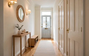
A narrow hallway needs light and continuity, because it is often the darkest space in a house and it connects rooms of different colours. Keep hallway walls pale and warm, carry the same pale colour through the whole hallway rather than changing colour at each doorway, and keep the ceiling white. A pale colour that matches the adjoining living room will make the hallway feel like part of the house rather than a separate tunnel.
A small home office or box room used as a study needs a colour that stays calm for long periods without feeling flat. Pale sage, pale blue-grey or pale greige all suit this use, with a white ceiling and light wood furniture. Avoid saturated colours on all four walls in a room where you sit facing a wall for hours, because a strong colour in the peripheral vision becomes tiring.
A small bathroom needs a colour that handles steam and light. Pale colours work best, with an eggshell or satin finish that can be wiped clean. Keep the ceiling white, keep tiles and paint in the same undertone direction, and use a mirror to bounce light, because a small bathroom often has only one small window.
Mistakes That Make a Small Room Feel Smaller
A few common mistakes undo an otherwise good small-room colour scheme. The first is choosing a colour from a sample card alone, without a large swatch in the room itself. A card is too small to show how a colour behaves across a wall, and it is viewed under shop lighting, not home lighting.
The second is mixing warm and cool undertones. Warm walls with cool grey furniture, or cool walls with warm wood and warm bedding, will feel unsettled even if each item looks fine alone. Pick a warm or cool direction and stay in it for walls, main furniture, rug and curtains.
The third is too many strong colours at once. A strong wall, a strong sofa, a strong rug and strong curtains in different colours make a small room feel busy, and a busy room feels smaller. Choose one strong colour, keep the rest pale, and repeat the strong colour in small amounts.
The fourth is a ceiling that is too dark, too coloured or too busy for the room height. In a standard small room, a coloured ceiling makes the ceiling feel lower. Keep it white and plain, unless you are colour drenching deliberately with a pale colour on every surface.
The fifth is forgetting evening light. A scheme chosen only in bright daylight will disappoint in the evening, when a living room and bedroom are used most. Check swatches and furnishings under lamps, with curtains closed, before committing.
The sixth is a high-contrast scheme on every surface. Sharp contrast chops a small room into pieces. Soft contrast, pale walls with slightly deeper furnishings, light wood with warm white woodwork, and a mid-tone rug on a pale floor, lets the eye travel smoothly and the room feel larger.
Frequently Asked Questions
What paint colour makes a small room look biggest?
No single colour wins in every room, because light direction decides which pale colour works. As a starting point, a pale warm white, pale greige or pale sage, used on most walls with a white ceiling and pale furnishings, will make most small UK rooms feel larger, because those colours reflect light, keep contrast soft and do not fight the light the room actually gets.
Does white always make a small room look bigger?
White helps when it is the right white for the light. A warm white in a north-facing room and a cool white in a south-facing room will both look bright. Brilliant white in a north-facing room can look cold and slightly blue, and a very creamy white in a south-facing room can look yellow in strong sun. Test the white in the room, at different times of day, before painting all four walls.
What is LRV and does it matter for a small room?
LRV, light reflectance value, is a number from roughly 0 to 100 that shows how much light a paint colour reflects. Higher numbers reflect more light. For a small room, it is a useful first filter: keep the main wall colour high, roughly in the pale range, and use lower LRV colours only as accents or on one wall. LRV alone does not decide a colour, because undertone and saturation matter too, but it stops a colour that is too dark for the room being chosen by mistake.
Should I paint the ceiling white in a small room?
Yes, in almost every small room. A plain white ceiling reflects light and makes the room feel taller. Painting the ceiling the wall colour only works well with high ceilings, or as part of a deliberate colour drench in a pale colour on every surface. In a standard small room, a coloured ceiling will make the ceiling feel lower.
Is a feature wall a good idea in a small room?
Yes, if the feature colour is muted and the other walls stay pale. A muted mid-tone behind the sofa or bed gives the room a focal point without closing it in. A dark or saturated feature wall, or a feature wall in a colour that clashes with the other walls, will make a small room feel more divided. Repeat the feature colour in cushions or artwork so it looks connected to the rest of the room.
Can dark paint make a small room look bigger?
Sometimes, when it is used deliberately on all surfaces to blur corners, with layered lighting and pale furniture. That effect is real but conditional, and it suits cosy rooms used mainly in the evening. In most small rooms with poor light, dark paint on all four walls will make the room feel smaller. The safer route is dark colour on one wall or in furnishings, with pale walls elsewhere.
What finish should I use in a small room?
Matt emulsion for most walls, because it hides imperfections and gives a soft surface. Eggshell or satin for woodwork and for rooms that need wiping clean, such as hallways and kitchens. Reserve high gloss for trim and doors, not for large wall areas, unless the walls are newly plastered and perfectly smooth.
How do I test paint colours for a small room?
Paint large swatches, at least the size of a sheet of paper, on the darkest wall and on the wall opposite the window, and look at them in morning, midday, late afternoon and evening light, with lamps on and curtains closed. Live with the shortlist for a few days, test the ceiling and woodwork colours alongside the wall colour, and if you are still unsure, choose the paler option.