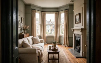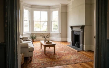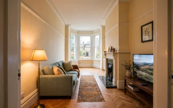
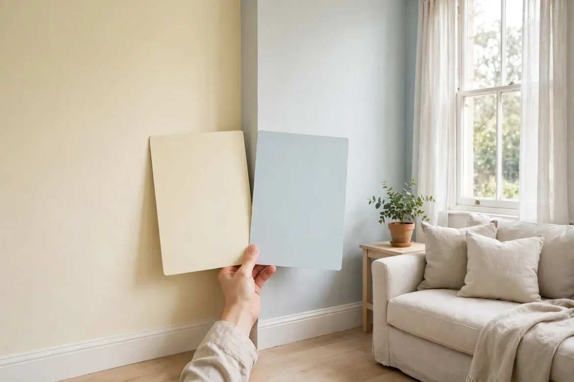
White paint is the hardest colour to choose, and that is not a failure of taste. It is because no white is truly neutral. Every white leans warm, towards yellow, cream or soft pink, or cool, towards blue, grey or green, and the lean that is invisible on a sample card becomes obvious once it covers four walls in your light. Choose the wrong lean and a north-facing living room turns grey-blue and chilly, or a bright south-facing bedroom turns yellow by late afternoon.
This guide gives you one decision flow instead of five overlapping explainers: undertone first, then the direction the room faces, then how the room is used, then the bulbs you already have, then a swatch test in your own light. The consensus below is drawn from the white-paint guides checked for this article, including PaintMyWalls, Edward Bulmer, SpruceChat, King Homes and Empire Property, restated here with their sources, not our own survey. Brand shades named in those guides, such as Farrow & Ball, Little Greene, Edward Bulmer and Craig & Rose, appear here as examples only. No shade is recommended as the best pick, and no prices are given, because a white that works in one room can fail in the next room of the same house.
Warm White, Cool White and Bright White: What the Names Mean
A warm white has a yellow, cream, beige or soft pink base. On the wall it reads as soft and welcoming, and it flatters skin tones, warm wood and warm fabrics. A cool white has a blue, grey or green base. On the wall it reads as crisp and clean, and it suits modern fittings, grey floors and a minimal look.
Bright white, sometimes sold as brilliant white, sits apart from both. It has almost no undertone, which sounds like the safe choice, but in practice it reads cool. In a bright room it can look clean and sharp. In a cool, north-facing room it can look stark, slightly blue and clinical, because there is no warmth in the paint to balance the cool light. If a white is described as pure, brilliant or icy, treat it as a cool white when you are choosing, not as a neutral one.
The practical point is that the name on the tin matters less than the undertone underneath it. Two tins both labelled warm white can lean in different directions, one towards yellow and one towards pink, and the difference shows up next to your sofa and your floor, not on the shelf. That is why the test at the end of this guide matters more than any shade name.
The Golden Rule: Match the White to the Direction the Room Faces
Every guide checked repeats the same rule, and it is the single most useful sentence in this article: warmer whites for darker, north-facing rooms, and cooler whites for bright, south-facing rooms. Warm feels cosy and traditional. Cool feels crisp and modern. The reason is balance. You are not matching the paint to the room. You are matching it to the light, so the light and the paint correct each other instead of doubling up.
North-facing rooms get cool, blue-grey, flat light all day, with no direct sun. A warm or soft white holds its warmth there, while a cool white can tip into grey-blue. South-facing rooms get strong, warm light most of the day. A cool or crisp white stays crisp there, while a warm white can drift yellow by late afternoon. East-facing rooms get warm sun in the morning and cooler light after lunch, so a slightly warm white is the safest middle choice. West-facing rooms are dim in the morning and golden in the evening, so a warm white glows when the low sun arrives, while a cool white can look grey until the sun gets there.
In a north-facing room, the light is indirect sky light with a cool cast, so a cool white matches the light instead of balancing it, and the walls can look grey by midday and chilly from October to March. A warm white adds back the warmth the light takes away. Our guide to north-facing living room colours explains the warm undertone rule in full, and the same rule applies to any north-facing room, not just a living room.
In a south-facing room the problem reverses. The light is strong and warm for much of the day, so a warm white can drift yellow by late afternoon, especially next to crisp white woodwork, where the difference shows. A cool white stays crisp in that light, and the room feels calm rather than hot. Our guide to south-facing room colours covers the cooling palettes that go with it.
East-facing and west-facing rooms sit in between, and the choice depends on when the room is used most. An east-facing bedroom, used mainly in the morning, suits a slightly warm white that looks fresh in the morning sun and stays calm in the evening. A west-facing living room, used mainly in the evening, suits a warm white that glows when the low sun arrives, while a cool white in the same room can look grey until the sun gets there.
If the room has a small window, faces a neighbouring wall or a lightwell, treat the light as north-facing even if the compass says otherwise. The light that actually arrives is indirect and weak, and the palette should follow the light, not the compass bearing.
Room by Room: Where Warm Whites Work and Where Cool Whites Work
Aspect decides the starting point, but how the room is used decides the finish. The guides checked agree on a broad pattern, and it is worth following unless the aspect of your room argues the other way.
Bedrooms and living rooms suit warm whites. These are the rooms where you relax, where lamplight matters as much as daylight, and where a soft, calm wall flatters skin tones and warm furnishings. A warm white in a bedroom feels restful at night under warm bulbs, and a warm white in a living room makes the seating area feel welcoming rather than stark. If the bedroom or living room faces south and gets strong sun, choose a warm white with a gentle undertone rather than a creamy one, and test it in the late afternoon, when the sun is at its warmest.
Kitchens and bathrooms suit cooler whites. These are working rooms, where clean and fresh matters more than cosy, and where cool whites pair well with modern fittings, chrome, white tiles and stone or grey floors. A cool white in a kitchen keeps the room feeling bright and hygienic, and in a bathroom it suits the pale tiles and mirrors that most UK bathrooms already have. The caution is a north-facing kitchen or bathroom, where a cool white can feel cold. In that case, choose a cool white with the softest undertone you can find, or a warm white with a very gentle base, and let the lighting do the crispness instead of the paint.
Hallways, landings and small rooms follow the light, not the room name. A north-facing hallway needs a warm white. A bright south-facing hallway can take a cool one. In a small room, the same logic applies, and our guide to paint colours that make a small room look bigger explains how a pale colour with the right undertone reflects light and keeps the room feeling open, while the wrong undertone closes it in even when the colour is pale.
Bulb Temperature Matters as Much as the Paint
The paint is only half the colour on your wall. The other half is the bulb, and the guides checked are clear that a warm bulb flatters a warm white and muddies a cool one, while a cooler bulb makes a warm white look yellow.
Most UK homes mix bulb temperatures without realising it. The ceiling light is often a cool daylight bulb, the table lamp is a warm one, and the kitchen downlights are something else again. Each bulb changes the wall colour in its own patch of the room, so the same white can look warm by the sofa and grey by the door. That inconsistency is often blamed on the paint, when the bulbs are the cause.
Before you choose a white, check the bulbs in the room. Warm white bulbs, usually labelled around 2700K, suit warm whites and make them glow. Cool white or daylight bulbs, usually labelled around 4000K and above, suit cool whites and keep them crisp. Keep the bulb colour consistent from lamp to lamp in one room. Mixed bulb colours make the wall colour look inconsistent from one side of the room to the other, however good the paint is.
This is also why you should test a swatch at night, with the lamps on, as well as in daylight. A white that looks right at noon under daylight can look yellow or grey at eight in the evening under your lamps, and the evening is when you actually live in the room. Our guide to layered lighting design for a living room explains the three layers, ambient, task and accent, and the same principle applies here: settle the paint and the bulbs together, not one after the other.
How to Tell Warm From Cool Before You Buy
There are two simple tests, and both are worth doing, because sample cards lie in shop lighting and on phone screens.
The first test is the paper test. Hold the sample card against a sheet of plain white printer paper. The paper is close to a true neutral white, so the undertone in the paint shows up by comparison. A warm white will look yellow, cream or pink next to the paper. A cool white will look blue or grey. A bright white will look almost the same as the paper. This test takes ten seconds, and it is the quickest way to sort a shortlist in the shop.
The second test is the swatch test, and it is the one that decides. Paint a large patch on the actual wall, at least the size of a sheet of paper, and look at it in daylight and at night with the lamps on, in the morning and in the late afternoon. Small sample cards lie, especially in north-facing light, because a small area does not show how a colour behaves across a whole wall. A large swatch on the wall, next to your sofa and flooring, tells the truth. If the swatch turns grey or blue by midday, the undertone is too cool for the room, however warm it looked in the shop. If it turns yellow by late afternoon, it is too warm for a bright south-facing room.
Test in more than one place in the room. The wall opposite the window gets the most light, and the wall beside the window gets the least, so a white can read differently on each. If the two walls disagree, choose the white that looks right on the wall you face most often, usually the wall opposite the seating, and keep the woodwork in a clean white that frames it rather than competing with it.
Finishes, Floors and Furnishings: What Pairs With Each White
Warm whites sit naturally with oak floors, terracotta, warm fabrics and natural wood furniture. The warmth in the paint and the warmth in the materials reinforce each other, which is why warm whites suit period homes, cottages and rooms with wooden floors. A warm white with a grey floor or cool stone can feel muddy, because the undertones disagree, so if the floor is cool, choose a warm white with a gentle undertone, or warm the room with textiles and wood furniture instead.
Cool whites sit naturally with grey or dark floors, modern fittings, chrome and pale stone. The coolness in the paint and the coolness in the materials agree, which is why cool whites suit new-build flats, modern kitchens and minimal rooms. A cool white with a warm oak floor can feel stark, because the floor is warm and the walls are not, so if the floor is warm, choose a cool white with a soft undertone, or cool the room with grey textiles and pale furniture.
The finish matters too. Matt or flat finishes suit a period-cottage feel and hide small imperfections in older plaster, which matters in most UK homes. A matt warm white on the walls with a satin finish on the woodwork is a practical combination: the walls stay calm, the woodwork is durable, and the slight contrast in sheen gives the room definition without a change of colour. Gloss finishes reflect more light and show every imperfection, so keep gloss for trim and woodwork, not for large wall areas.
Keep the woodwork in a clean white that is one step lighter or cleaner than the walls. That gives the room crisp edges and stops doors and skirting blending into a muddy whole. If the walls are warm white, use a slightly cleaner white for the woodwork. If the walls are cool white, use a white woodwork that matches the coolness, so the two do not fight.
A Worked Example: Two Rooms in the Same House
Take a typical Victorian terrace with a north-facing living room at the front and a south-facing kitchen at the back. The two rooms need opposite whites, and that is normal. A house does not need one white throughout. It needs the right white in each room.
In the north-facing living room, choose a warm white with a soft yellow or beige undertone. Paint a large swatch on the chimney breast wall and on the wall opposite the bay window, and check it in the morning, at midday and in the evening with the lamps on. Pair it with warm white bulbs throughout, an oak floor or a large warm rug, and a slightly cleaner white on the woodwork so the doors and skirting read as intentional. Avoid a cool white here, because the flat north light will pull it grey-blue, and avoid a very creamy warm white, because it can turn yellow under warm lamps in the evening.
In the south-facing kitchen, choose a cool white with a gentle blue-grey undertone. Test the swatch in the late afternoon, when the sun is strongest, and check it next to the worktop and the tiles, because a warm white can drift yellow in that light and look dingy next to crisp white fittings. Pair it with cool white bulbs in the downlights, pale stone or grey flooring, and white woodwork that matches the coolness. If the kitchen is north-facing instead, reverse the choice: a soft warm white, with the crispness coming from the lighting and the fittings rather than the paint.
The same tin will not look the same in both rooms. That is the whole point of this guide. Light is the deciding factor, and the same white reads differently by aspect, by bulb and by time of day.
Mistakes to Avoid
The most common mistake is a cool white in a north-facing room. It tips into grey-blue and feels chilly from October to March, when the light is at its coolest and the room is used most in the evening. The fix is a warm white, or a cool white with the softest undertone available, tested on a large swatch in the room itself.
The second mistake is a warm white in a very bright south-facing room. It can look dingy next to crisp white woodwork, especially in the late afternoon, when the warm sun exaggerates the yellow undertone. The fix is a cool white, or a warm white with a very gentle base, tested in the late afternoon rather than the morning.
The third mistake is judging a white on a small card, in the shop, under retail lighting. Shop lights are bright and cool, and they flatter cool whites and flatten warm ones. A card that looks right in the shop can look wrong on your wall. Always test a large swatch in the room, in daylight and at night.
The fourth mistake is mixing bulb temperatures in one room. One warm lamp and one cool ceiling light will make the same white look different on opposite walls, and the room will feel unsettled without an obvious cause. Keep the bulbs consistent, and test the swatch with the lamps you will actually use.
The fifth mistake is choosing the white before the floor and the furnishings are settled. A warm white with a cool grey floor, or a cool white with a warm oak floor, will fight the room. Settle the floor first, or at least know which way it leans, then choose the white that agrees with it.
The sixth mistake is painting the ceiling the wall colour in a standard UK room. In almost every room, keep the ceiling plain white, so the room feels as tall as possible. Carrying the wall colour onto the ceiling only works in a room with high ceilings, where it softens the junction and makes the room feel more enclosed and cosy.
Frequently Asked Questions
Is warm white or cool white better?
Neither is better on its own. Warm white suits darker, north-facing rooms, bedrooms and living rooms, where cosy matters. Cool white suits bright, south-facing rooms, kitchens and bathrooms, where crisp and clean matters. Match the white to the light in the room and to how the room is used, not to a preference for warm or cool in general.
How can I tell if a white paint is warm or cool?
Hold the sample card against a sheet of plain white printer paper. A warm white will look yellow, cream or pink next to the paper. A cool white will look blue or grey. Then paint a large swatch on the actual wall and check it in daylight and at night, because the undertone shows differently in your room than it does in the shop.
What is the difference between warm white and brilliant white?
Brilliant white has almost no undertone, so it reads as a clean, stark white. In practice it reads cool, especially in north-facing rooms, where it can look slightly blue and clinical. A warm white has a yellow, cream or pink base, so it reads as soft and welcoming. If a room feels cold with brilliant white on the walls, a warm white is usually the fix.
Should the ceiling be the same white as the walls?
In most UK rooms, keep the ceiling plain white, so the room feels as tall as possible. Painting the ceiling the wall colour can work in a room with high ceilings, where it softens the junction between wall and ceiling, but in a typical room with a standard ceiling height it will make the ceiling feel lower.
Can I use warm white in a kitchen?
Yes, if the kitchen is north-facing or has weak light, a soft warm white is often the better choice, because a cool white can feel cold there. In a bright south-facing kitchen, a cool white usually works better, because a warm white can drift yellow in strong sun. Test a large swatch in the late afternoon, next to the worktop and tiles, before you commit.
Do I need different whites in different rooms?
Often, yes. A north-facing living room and a south-facing kitchen in the same house usually need opposite whites, and that is normal. A house does not need one white throughout. What matters is that the whites in connected rooms do not clash at the doorway, so keep the undertones in the same family where rooms flow into each other, and use the woodwork white to tie them together.