Most advice about small rooms says the same thing: keep it pale, keep it plain, keep it empty. It is good advice for a show home. It is poor advice for a person who loves colour, pattern and objects, because a pale empty room is not a calm room for them. It is a dull one.
Maximalism has the opposite reputation problem. Mention bold colour and layered pattern in a small flat and most people picture chaos: every surface covered, nothing matching, nowhere to put a cup of tea. Yet the most joyful small homes prove the opposite. When colour is chosen with intent and every object earns its place, a small room can be vivid, personal and genuinely restful. Small rooms are, in fact, some of the easiest places to go maximalist, because there is less square footage for a scheme to feel diluted across. One bold wallpaper wall, one jewel-toned sofa and one gallery wall can carry a whole room, where the same pieces in a large open-plan space would need repeating three times to register at all.
This guide is about the rules that keep a small maximalist room coherent: a three-colour discipline, pattern at three scales, one anchor piece, gallery density with a unifying frame, and rest zones where the eye can land. It covers the living room, the bedroom and the small in-between spaces, and it works for UK homes specifically: Victorian terraces, 1930s semis, new-build flats and box rooms, with low winter light, radiators, fireplaces and chimney breasts as part of the plan rather than obstacles to it.
What Maximalism Actually Is
Maximalism is not buying more things. It is letting the things you already love take centre stage and giving them a calm framework to sit inside. A maximalist room is a collection with rules, not a pile. The difference between a maximalist room and a cluttered room is not how much is in it. It is whether the things in it relate to each other.
Three principles separate a maximalist room that feels rich and intentional from one that just feels busy. First, the colour is disciplined, even when it is bold. Second, the pattern is varied in scale, even when it is layered. Third, every object has a place, and the room still has empty surfaces. A maximalist room with no empty surface is not maximalist. It is a storage unit with good taste.
The test is simple. Stand in the doorway and look at the room for ten seconds. If your eye can find three things it likes and then rest somewhere calm, the room works. If your eye keeps moving because nothing holds it and nothing lets it stop, the room needs editing, not more decoration.
The Three-Colour Rule: Colour Discipline First
Maximalism only tips into clutter when every colour in the rainbow competes at once. The fix is a disciplined palette: choose three colours you love and repeat them in different proportions all through the room. A terracotta sofa, sage cushions, a blush throw and a print that ties all three together will read as a considered collection, even when the room is full.
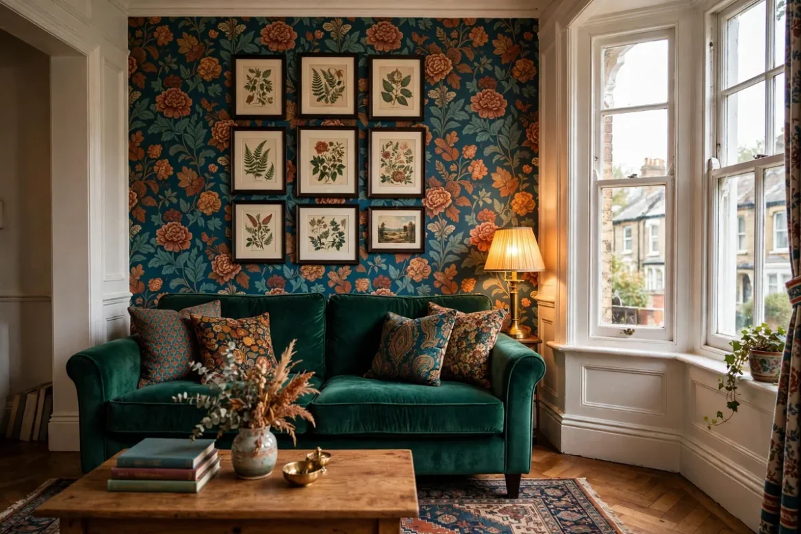
Pick the three colours before you buy anything. One is the dominant colour, usually the wall or the sofa, and it takes roughly half the room. One is the secondary colour, usually the rug, the curtains or a large piece of furniture, and it takes roughly a third. One is the accent, usually the cushions, the art, the lamp and the small objects, and it takes the rest. The proportions matter more than the colours themselves. A room that is half deep teal, a third rust and a splash of ochre feels designed. A room that is equal parts teal, rust, ochre, pink, yellow and navy feels like a paint chart exploded.
Neutrals count as colours in this rule, and they do useful work. A warm white ceiling, a natural wood floor or a plain linen cushion is not a failure of boldness. It is the breathing space that lets the three colours read. In a small room, one of the three colours can be a neutral and the room will still feel maximalist, because the pattern and the objects carry the abundance.
Warm and cool matter as much as the hues. In a north-facing room, cool colours turn grey and flat, so lean warm: rust, ochre, deep green, warm pink. In a south-facing room, the light is strong enough to carry cooler tones. Our guide to north-facing living room colours explains the undertone test in full, and it is worth doing before choosing a bold wall colour, because a maximalist scheme depends on the wall colour underneath it.
Pattern Scale: One Large, One Medium, One Small
Pattern mixing is where many maximalist rooms go wrong, and the rule that saves it is simple: vary the scale. Pair a large-scale floral cushion with a small-scale stripe, or a bold geometric rug with a fine gingham throw. One large pattern, one medium pattern and one small pattern is a reliable recipe for any small space.
The large pattern is the room’s statement: the wallpaper, the curtains or the sofa fabric. It should appear once, on one surface, and it should be the pattern everything else answers to. A bold floral wallpaper on one wall is a large pattern. The same floral on the wallpaper, the curtains, the cushions and the rug is not a large pattern. It is a single pattern repeated until it shouts.
The medium pattern is the support: a rug with a strong motif, a striped throw, a checked armchair. It should share at least one colour with the large pattern and at least one with the small pattern, so the three patterns feel like a family rather than three strangers. The small pattern is the detail: a fine stripe on a cushion, a tiny geometric on a lampshade, a small print on a book cover. It is the pattern you notice when you sit down, not the pattern you notice from the doorway.
Keep the total pattern count to three. Four patterns can work if two of them are very small and very quiet, but five patterns in a small room almost never work, however good each one is on its own. If a pattern does not share a colour with the other two, it does not belong in the room, however much you love it on its own. Love it in another room instead.
Start With One Anchor Piece
Rather than trying to style an entire room in one go, choose a single item you love. A sofa in a striking fabric, a bold wallpaper, a large piece of art, a patterned rug. Whichever you choose, let it dictate everything else. The anchor is the decision that makes all the other decisions easy, because every later choice is a question with a simple answer: does this sit well with the anchor?
In a small living room, the anchor is usually the sofa or the wallpaper, because they are the two largest surfaces. A jewel-toned velvet sofa in emerald or sapphire anchors a room on its own, and everything else can be quieter. A bold wallpaper on one wall anchors a room even with a plain sofa, because the wall does the shouting and the sofa does the listening. Choose one anchor, not two. A bold sofa against a bold wallpaper is a fight, and in a small room there is nowhere for the loser to retreat to.
The anchor also sets the budget logic. Spend the money on the anchor and save on the rest, because the anchor is the piece that carries the scheme and the piece you will look at every day. Cushions, throws, prints and small objects can be secondhand, swapped, or changed with the seasons. The anchor cannot. Our guide to paint colours that make a small room look bigger covers the colour and light logic that supports an anchor choice, including which colours hold their depth in low UK light.
The Gallery Wall: Density Without Chaos
A gallery wall is the classic maximalist move, and it works beautifully in a small room because it uses vertical space that would otherwise sit empty. The trick that keeps it calm is a single unifying element: paint every frame the same colour, or use identical slim frames throughout, and let the art inside be as wild and varied as you like. Bold prints, family photographs, postcards and a child’s drawing can all hang side by side, and the matching frames hold them together like a good binding holds a messy, much-loved book.
Plan the layout on the floor first. Lay the frames out on the rug, move them around until the arrangement feels balanced, and only then put hooks in the wall. Keep the gaps between frames consistent, usually about five centimetres, and keep the outer edges roughly rectangular, even if the frames inside are different sizes. A gallery wall with a ragged outer edge looks accidental. A gallery wall with a clean outer edge looks deliberate, however varied the contents.
One gallery wall per room is enough. Two gallery walls in a small room compete with each other, and the room starts to feel like a corridor in a gallery rather than a place to sit. If the room has a chimney breast, the wall above the fireplace is the natural home for the gallery, because the fireplace already gives the wall a centre. If there is no fireplace, choose the wall the sofa faces, so the gallery is something you look at rather than something behind you.
Hang the wall with removable picture strips or small hooks where the plaster is fragile, and check the weight limits before hanging anything heavy. In a rented home, removable strips keep the deposit safe and the gallery reversible, which matters when the whole point of maximalism is that the collection can grow and change.
Rest Zones: Where the Eye Lands
Every maximalist room needs rest zones: places where the eye can stop. A rest zone is a plain surface, a gap, a stretch of wall with nothing on it, a clear shelf, a plain cushion among the patterned ones. Without rest zones, the room is exhausting, because the eye never gets to stop moving. With them, the room feels rich rather than relentless.
The easiest rest zone is the ceiling. Paint it warm white and leave it alone. A patterned ceiling in a small room is almost always a mistake, because it presses down on the room and gives the eye nowhere to go. The second easiest rest zone is the floor. A plain wood floor, or a rug in one quiet colour under the furniture, grounds the room and lets the pattern above it breathe. The third is the sofa itself: one plain cushion among the patterned ones, or a plain throw folded over one arm, gives the seating a pause.
Think of rest zones as punctuation. A room with no rest zones is a sentence with no full stops. It is technically full of meaning, but nobody can read it comfortably. Leave one wall mostly bare, one shelf mostly empty, and one surface completely clear, and the bold parts of the room will look bolder, not weaker, because they have something plain to stand against.
Furniture That Earns Its Place in a Small Room
In a tight space, trying to maximise space by using only smaller furniture items is common. But overfilling a small room with small furniture makes it feel cluttered. Strategically incorporating oversized pieces creates comfort and elegance instead. A generously sized sofa or a proper deep armchair reads as more considered than several smaller, tentative pieces. One large sofa and one armchair fill a small living room better than a sofa, two small chairs, a pouffe and a bench, because the eye counts pieces, not square metres.
Functionality comes first. Conceal-and-reveal storage, a coffee table with a shelf, a sideboard with doors, a footstool that opens: these pieces hold the objects that would otherwise spill onto every surface, and a maximalist room needs its objects contained. Open shelving works when it holds things you actually use and love. It fails when it holds everything you own, because then the shelf is storage, not display, and the room reads as crowded rather than curated.
Keep walkways clear. A small room needs at least 60 centimetres of clear passage between furniture, and a maximalist room needs it more than a plain one, because the visual density already makes the room feel full. If you have to turn sideways to pass the coffee table, the room has too much furniture, however beautiful each piece is. Our guide to small living room layouts for UK terraced houses sets out measured layouts for the three real UK room shapes, with the clearances that matter, and it is the right page to read before buying the anchor piece.
The Living Room
The living room is where most people start maximalism, because it holds the largest pieces and the most pattern. Start with the anchor, then build outwards. If the anchor is the wallpaper, keep the sofa plain and let the cushions carry the pattern. If the anchor is the sofa, keep the walls plain and let the art carry the pattern. Either way, one surface shouts and the others speak at normal volume.
Layer the textiles, but count them. Four cushions in three patterns is a full sofa. Six cushions in five patterns is a cushion shop. A rug in a strong motif under the front feet of the seating pulls the group together, and in a small room the rug should be as large as the room allows: a larger rug expands the room visually, while a small rug floating in the middle of the floor makes the room feel smaller. Our rug size guide for UK living rooms gives the centimetre table by sofa size, and the front-feet rule that matters most in a dense scheme.
Lighting should be layered and warm. A table lamp, a floor lamp and a picture light over the gallery wall do more for a maximalist room than a bright ceiling light, because they light the objects in pools rather than flooding the whole room. Use warm white bulbs, and keep the ceiling light for cleaning. Mirrors help too: a large mirror on the wall opposite the window bounces light back into a dense scheme and keeps it from feeling heavy, and a mirror with a bold frame is itself a maximalist object.
The Bedroom
A maximalist bedroom follows the same anchor logic, except the anchor is almost always the bed. A statement headboard in a jewel-toned velvet, a striking pattern, or a bold contrast to the wall behind it gives the whole room a natural focal point and a foundation to layer from. Richly textured bedding, a fringed or quilted throw, and two patterned cushions add depth without much risk, since they are the easiest and cheapest elements to swap.
Wallpaper is particularly effective in bedrooms, because you spend long close-up periods of time in the room, so a print you love is worth the commitment. One wall behind the bed, or a colour-drenched scheme where the walls, ceiling and woodwork share one deep colour, can make a small bedroom feel more enveloping rather than more cramped. Colour drenching works in a bedroom precisely because the room is small: there is less wall for the colour to overwhelm, and the effect is cocooning rather than oppressive.
Keep the surfaces disciplined. A bedroom needs calm more than display, so give the bedside tables one item each: a lamp and a book, or a lamp and a glass of water. A dressing table with a mirror and a few loved objects is enough. If the room has a wardrobe, keep its doors closed, because an open wardrobe in a maximalist bedroom is visual noise on top of visual richness, and the room will tip from rich into chaotic.
Small In-Between Spaces
Transitional spaces are the easiest place to be bold, because nobody sits in them all day. Hallways, landings and downstairs loos are ideal for a bolder wallpaper choice than you might risk in a room you sit in all day. A small hallway in a deep colour with a patterned runner and one framed print is a maximalist moment that costs little and commits to nothing, because you pass through it rather than living in it.
The downstairs loo is the classic test room. It is small, it is used briefly, and it has one wall that can take a dramatic print without any consequence for the rest of the house. If you are unsure whether maximalism suits you, start here. Live with a bold loo for a month. If you love walking into it every day, you will love a bold living room. If you tire of it within a week, you have learned something cheaply.
Rented Homes and Reversible Maximalism
Maximalism suits rented homes better than most styles, because most of it is furniture, textiles and art rather than paint on walls. A bold sofa, patterned cushions, a large rug, a gallery wall hung with removable strips and a statement lamp all move with you. If you cannot paint the walls, use the textiles and the wood to carry the colour, and keep the walls as they are.
Where paint is allowed, one bold painted moment does the work of a whole scheme: an arch behind the sofa, a single feature wall, or a stripe of colour around a doorway. A painted arch is cheap, fast, and easy to paint over, and it gives the eye a focal point without committing the whole room. Removable wallpaper on one wall is the other reversible option, but check the quality before committing, because cheap removable wallpaper peels at the edges and looks worse than no wallpaper at all.
Get written permission before painting or hanging anything heavy, and keep the receipts for removable fixings. A deposit dispute over picture hooks is the least maximalist outcome of all.
Mistakes That Turn Maximalist Into Clutter
The most common mistake is too many colours. A room with six or seven colours competing at full strength has no hierarchy, and the eye does not know where to look. Fix it with the three-colour rule: pick three, remove everything that does not contain at least one of them, and the room will calm down immediately.
The second mistake is pattern at one scale only. Five cushions in five different large florals do not layer. They shout over each other. Fix it with the scale rule: one large, one medium, one small, and remove the patterns that duplicate a scale.
The third mistake is no rest zones. A room where every wall, every shelf and every surface is full has nowhere for the eye to land, and it feels tiring rather than rich. Fix it by clearing one shelf completely, leaving one wall mostly bare, and putting one plain cushion on the sofa.
The fourth mistake is too many small pieces of furniture. Six small chairs, three small tables and a pouffe fill a small room with legs and edges, and the room feels crowded. Fix it by removing the smallest pieces first: one large sofa and one armchair will always read better than four small seats.
The fifth mistake is buying everything at once. A maximalist room that is bought in one afternoon looks like a shop display, because the pieces have no history and no relationship to each other. The style works because the pieces look collected over time. Buy the anchor, live with it for a month, and let the rest of the room grow around it.
Frequently Asked Questions
Does maximalist decor work in a very small room?
Yes, and often better than in a large one. A small room needs fewer pieces to feel full, so one bold wallpaper wall, one jewel-toned sofa and one gallery wall can carry the whole scheme. The rules matter more, not less: three colours, three pattern scales, one anchor, and rest zones where the eye can land. A box room or a small flat living room is one of the best places to try the style, because the commitment is small and the effect is immediate.
How do I stop a maximalist room looking cluttered?
Give everything a place and keep surfaces clear. Three colours only, pattern at three scales, one gallery wall, closed storage for the things you use every day, and no more than three items on any surface. If a room feels crowded, remove one piece of furniture before adding any decoration. A maximalist room should feel full, not crowded, and the difference is whether you can see the surfaces.
Can I do maximalism in a rented home?
Yes. Most of the style is furniture, textiles and art, all of which move with you. Use removable picture strips for the gallery wall, a bold rug and cushions for the colour, and one painted arch or feature wall only if the landlord agrees in writing. Avoid anything that damages the plaster or needs filling when you leave.
What is the cheapest way to start?
Start with the soft furnishings. A patterned rug, two cushions in different scales and a throw in your accent colour will change a plain room for very little money, especially secondhand. Add the gallery wall next, using frames you already own painted one colour, and prints from charity shops, postcards and family photographs. The anchor piece, usually the sofa or the wallpaper, comes last, once you know the palette works.
Is maximalism the opposite of minimalism?
Not exactly. Minimalism removes things until only the essential remains. Maximalism keeps the things you love and gives them rules. A maximalist room still edits: it edits by colour, by scale and by place, rather than by removal. The two styles share the same discipline, applied in opposite directions, and a maximalist room that has been edited well feels just as calm as a minimalist one, only warmer.